"The Desk" turns my portfolio into a maker's scrapbook: polaroids held by washi tape, sticky-note facts, a wax-sealed certificate and a red string that literally connects the projects. Everything is plain HTML, CSS and a little vanilla JS - no frameworks, no build step, no external requests.
1 · The concept
Portfolios usually feel like software. This one is meant to feel like a physical object - the desk of someone who actually makes things. Every element pretends to obey paper physics: photos sit in white polaroid frames at slightly random angles, tape strips have torn ends, sticky notes cast a curled shadow, sections tear apart like ripped sheets.
The centerpiece is the project wall: nine polaroids pinned with red push-pins and joined by one sagging red thread - an investigation wall, but cozy. You can drag any polaroid with the mouse; the string follows in real time, and on release the photo springs back home with a wobble. The contact form is a postcard, complete with a perforated stamp, a circular postmark and a red "SENT!" stamp on success.
2 · Type & color
Caveat 700headings - handwriting with a thick marker (supports the ć in Gobeljić)
Patrick Handannotations, labels, pen scribbles and the postcard handwriting
Manrope 400–800all body copy - the readable counterweight to the handwriting
warm paper#F6F1E7
kraft cardboard#D9C7A7
ink#2B2620
marker blue#2456D6
red string#C0392B
sticky yellow#FFE97A
3 · Techniques
Paper fiber, no images
The paper grain is an inline SVG feTurbulence noise, encoded as a data URI and layered over the base color on every surface - body, kraft header, torn edges.
Each section starts with a strip carrying the previous section's color, clipped by a jagged polygon(). The drop shadow lives on a wrapper, because filter is applied after clip-path - so the shadow follows the tear.
One SVG overlays the project board. Every polaroid owns an invisible pin anchor; a quadratic curve is threaded between them with a control point pushed downward - gravity for thread. Pin heads are drawn last so they sit on top of the string.
let d = `M ${pts[0].x} ${pts[0].y}`;
for (let i = 1; i < pts.length; i++) {
  const a = pts[i-1], b = pts[i];
  const sag = Math.min(64, 16 + Math.hypot(b.x-a.x, b.y-a.y) * .07);
  d += ` Q ${(a.x+b.x)/2} ${(a.y+b.y)/2 + sag}, ${b.x} ${b.y}`;
}
Draggable polaroids that spring home
Pointer events (mouse only, so touch scrolling stays intact) move the photo with gsap.set; on release an elastic tween snaps it back while redrawing the string every frame.
Underlines, arrows and the circle around "8+ years" are SVG paths animated with the classic dash-offset trick, triggered by GSAP ScrollTrigger - and skipped entirely when prefers-reduced-motion is set.
The stamp's perforation is four repeating radial gradients - half-dots punched along each edge in the postcard's color. The success stamp gets its worn-ink look from a turbulence-based mask-image.
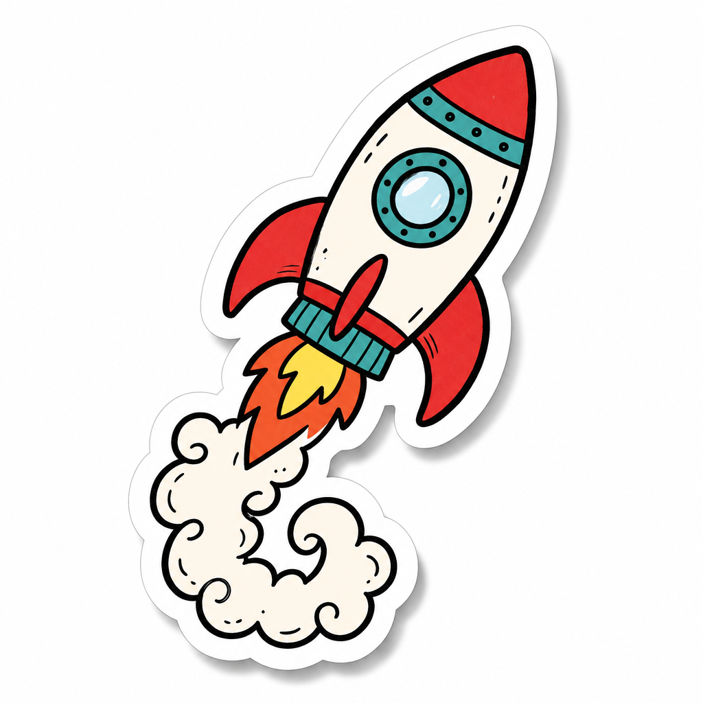
The three doodle stickers "stuck" around the headings - a laptop, a coffee cup and a rocket - were generated with OpenAI GPT Image 2. They come on plain white squares, so they're blended onto the paper with mix-blend-mode: multiply: white disappears, ink stays, and the sticker inherits the paper grain underneath. No video assets were needed on this site.